Refreshed And Recharged: Meet Our New Family Of Logos
The introduction of AR mode has evolved vTime into vTime XR - the world’s first cross-reality social experience. With the change of name came an opportunity to energize vTime’s branding.
Early Days
vTime’s first logo has been with us since 2015. The lozenges, a central part of the vTime brand, represented the ‘V’ of virtual, and also the VR headsets that vTime would launch upon. Accompanied by the word 'vTime' styled with a serif font, the lozenges were originally grey. They changed color in 2016 as we introduced a new avatar system.
Fast-forward to 2019. vTime will soon be home to multiple experiences, and our new branding needed to reflect where we’re headed and to give some vital distinction between the company and our family of products.
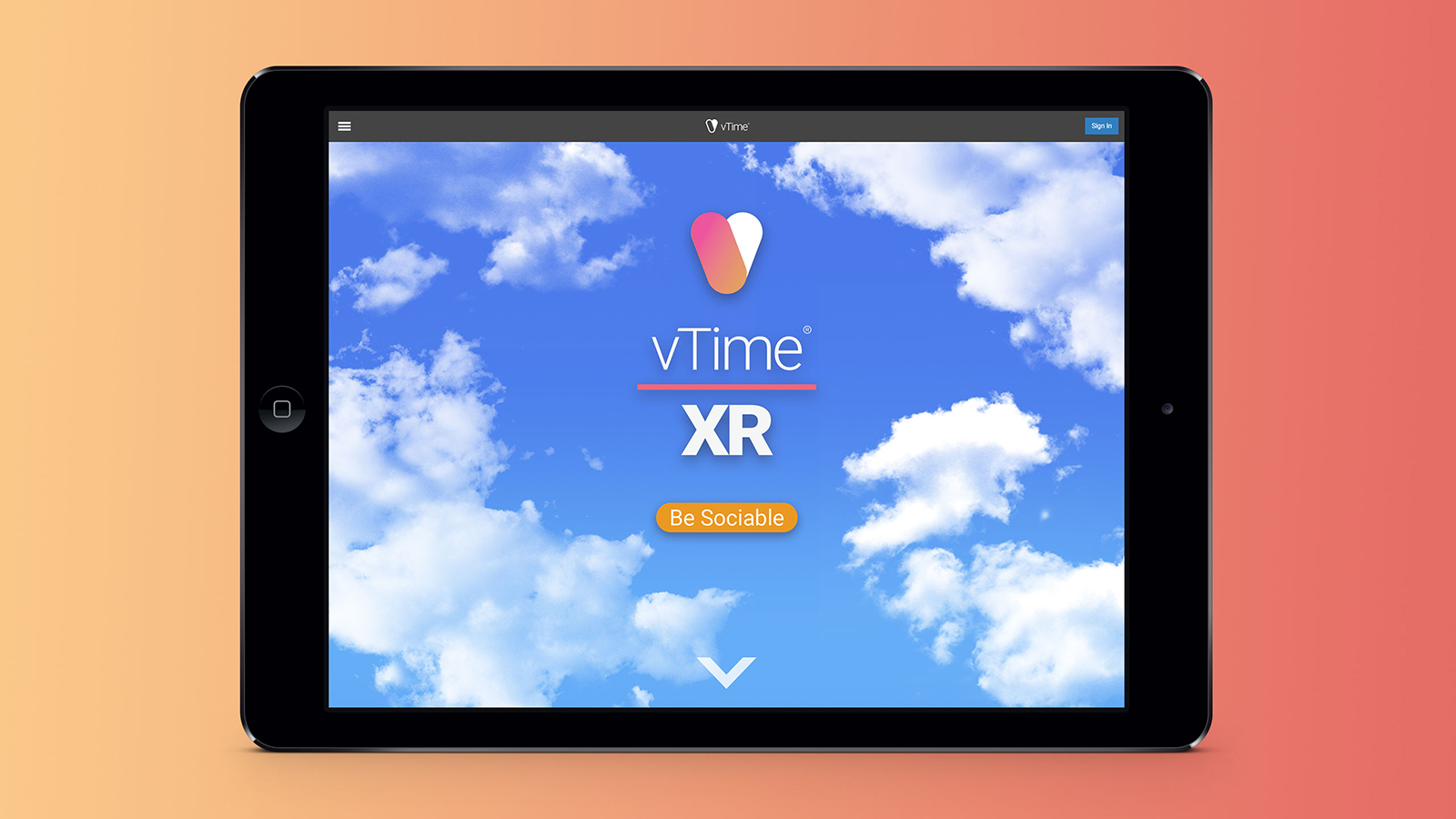
vTime XR
Our flagship product vTime has evolved into vTime XR. The world-first fusion of AR and VR virtual chat changed everything, allowing users in different realities (augmented or virtual) to connect in the same virtual space. We wanted the name to reflect the network’s new cross-reality capabilities, so added the term ‘XR’. Meaning cross-reality or extended reality, XR brings together AR and VR under one umbrella. Our new logo moves to a sans-serif font for a modern feel, and also adds a split line to separate the vTime name from the product skew - in this case ‘XR’. This formula will give us room to add more products that visually feel like part of the vTime family.
Here’s the new logo in its different lockups:
The new logo and name also gave us the opportunity to refresh vTime’s brand animation…

vTime: the company
Last year saw vTime raise $7.6 million in our series A funding round. We also went international, expanding into North America with the hire of notable industry expert Brian Blau, who joined as senior vice president. We refer to both vTime Limited and vTime Inc (our stateside company) as vTime. The company now has its own logo to help differentiate it from our product family…
Here’s the new company logo.
vTime.net
We couldn’t rebrand the products and company without recharging the website. vTime.net has a new home page that gives us room to tell new users what vTime is about. We’re currently redesigning the logged in area to give our users easier access to the features that they care about the most. You’ll see the results of that shortly.
We hope you’re as excited as we are about our latest update and new visual identity. It marks the start of a new phase for the studio, and sets the stage for the innovations we have waiting in the wings.
Tell us what you think! Send your feedback to feedback@vtime.net